The Issue:
Information privacy in the digital age is an ever growing issue. It seems like almost every week there is a new news story about how an app or service is abusing their users data. Despite the frequency of these occurrences and the outrage of users, a large majority of people freely give up their personal data to companies that are less than reputable. Our group wanted to find out what was causing this irresponsible behavior and see if we could promote more responsible decision making.
Problem Framing:
In order to tackle this problem of irresponsibly giving up personal information, we decided to look at where the exchange of this information occurs, Permission Pop-Ups. We have all encountered these types of pop-ups before and rather we care to admit or not most of us have at least occasionally mindlessly hit accept or deny without looking at the content presented. This certainly isn’t the most healthy for protecting your data but the response is highly understandable. Let’s look at two examples of common permission Pop-ups to see why.


As you can see from the images above, despite being for two completely different applications that have completely different privacy contracts, The pop-ups are virtually identical with exception of the company name. We are constantly bombarded with these types of permission pop-up, most of which look identical, so it’s not surprising that many people begin to form a habit of either automatically accepting or denying the pop-up without reading the content. In order to combat this issue, we need to create a pop up that 1. presents the user with unique information for the given application and 2. Always looks at least marginally different at a glance to prevent habit forming.
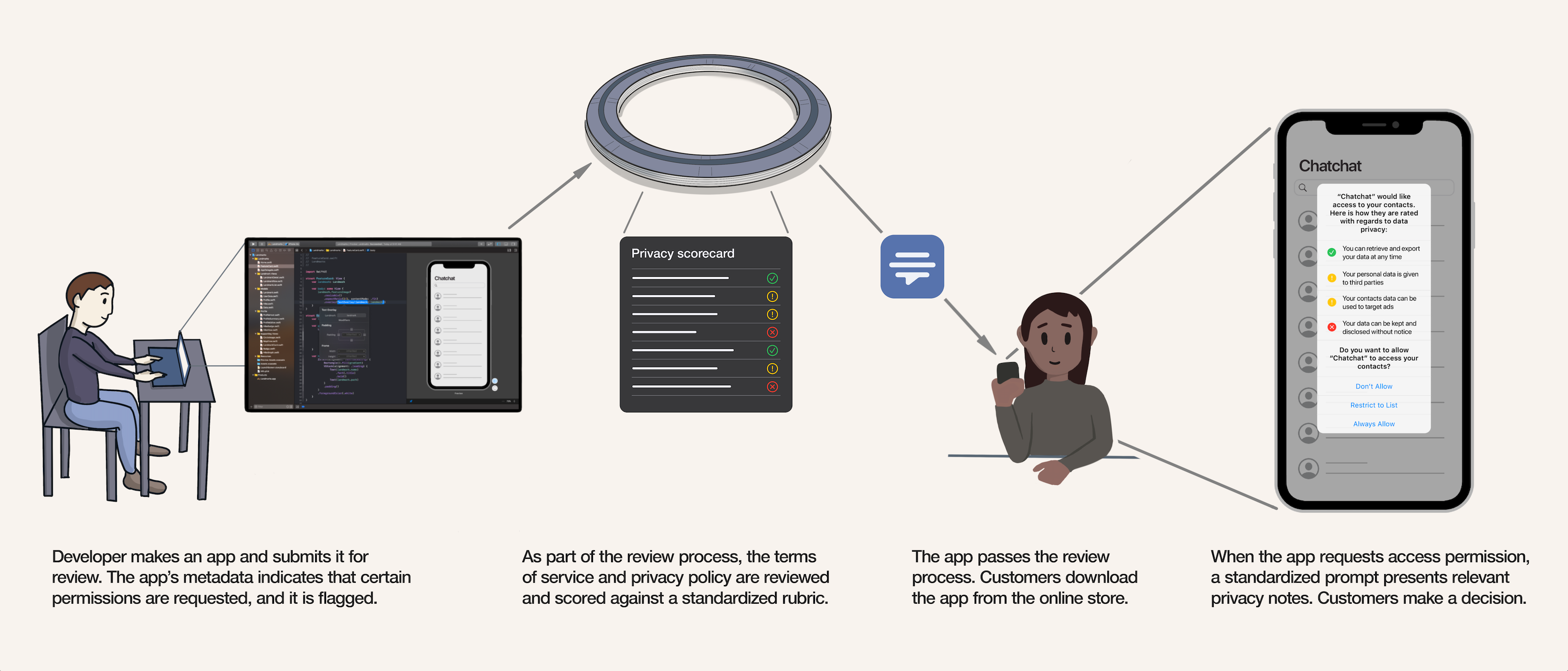
Our Solution:
Using the criteria above, we developed the permissions pop-up shown below


Our pop-up design has two key features. The first is that it provides a list of specific information about the app’s privacy policies as they relate to the permission you’re being asked to accept. This allows the user to make a more informed decision about whether or not to accept the permissions request without having to do extensive research themselves. Services like this already exist to some extent, one prominent example being “Terms Of Service; Didn’t Read”, a 3rd party website that assigns ratings to websites based on their terms of service. Bundling this type of information into a pop-up form is very feasible and would allow for much more meaningful pop-ups. The second feature of our pop-up design is the use of color to convey negative or positive attributes. While the use of color is minor it’s enough to grab you attention as the pattern will be different for every application, encouraging users to engage with the content instead of just mindlessly clicking away.
Storyboard of Interaction:

Testing
In order to test the effectiveness of our new pop-up design, we created a mock-up of an onboarding experience for an app named “ChatChat”. A user would go through the onboarding experience and be presented with either a traditional or a new permissions pop-up whenever the app requested permissions. During these tests we recorded which buttons the user clicked as well as how long the user engaged with the Pop-Up. The reason why we recorded time in these tests is to see if people on average engaged with the new pop-up more. Both pop-ups were similar in length so an increase in view time would likely be indicative of more thoughtful engagement. The image below shows our test results.

Due to the small sample size, it was relatively hard to draw any conclusions out of the quantitative data. However, through discussions that we had with the users after the test was performed we were able to learn some things. The hypothesis that people generally tend to skim the content and pick the same answer they always do when looking at the traditional pop-up held true. People also tended to like seeing the more specific information on the pop-up as it helped them make a more informed decision. With such a small sample size it’s hard to tell if the new pop-up performs better than the traditional pop-up especially without having a baseline for each tester. If we were to run this experiment again, we would present each user with both types of pop-up during the onboarding process so we could directly compare how each user responds to the different types.
Conclusion
The biggest take away from the testing was just how ineffective permissions pop-ups currently are. Many of the users blew through the traditional pop ups without looking at them at all and just answered how they always would. Permission pop-up should be more than just a warning that you brush away without thinking, they are an opportunity to provide the user with valuable information that can help them make a smart decision. Our updated pop-up is definitely a step in the right direction but it can be greatly improved to help users be more mindful in their decision making.