Contact Marketing and Purchasing; A Masterclass in Persuasion Tactics
by Em Blank
In my own personal experience with the process of buying contacts, I will say that I’m a bit of a special case, in that I have very bad vision so require stronger contacts than most online stores sell. Thus, this is based on my experience in doctor’s offices rather than the ‘modern method of buying contacts, though I will try to touch on that as much as I can. In terms of getting contacts through a doctor’s office, there are several factors that affect which brand of contact one can buy. Prescription strength, whether or not you have an astigmatism, prohibitive cost, and many other things come into play. To hone in on the design aspect of this process, one must look at how the contact lenses are branded.
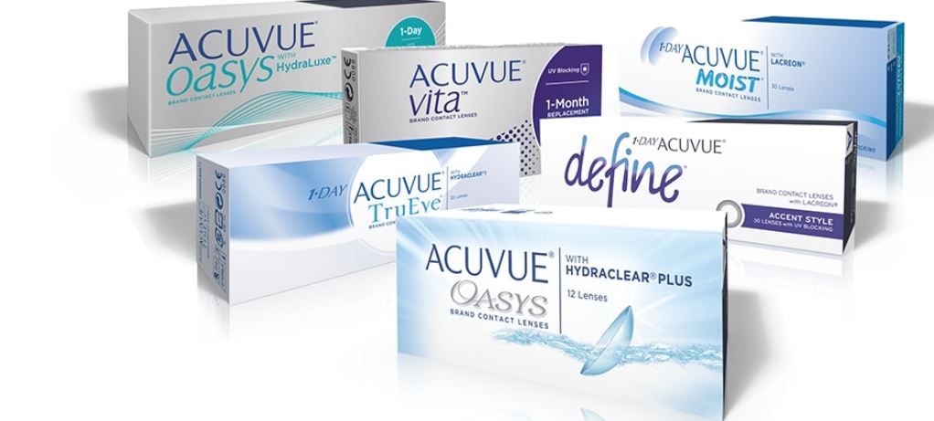
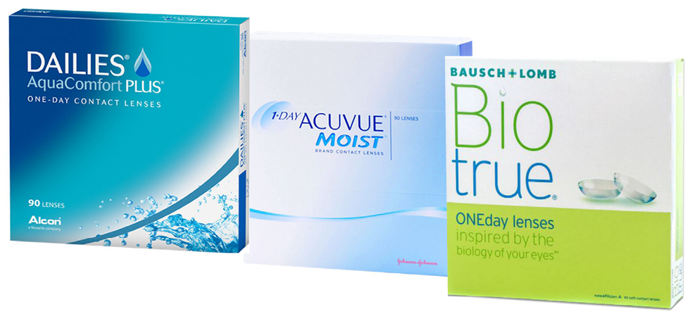
In a typical move of medical services, the first thing to notice about contact lense packaging is the color scheme. The discourse of health has a distinctive color palette; the main color is often white, with blue and green coming in at a close second. There may be elements of other colors at times, but if there are, they’re rainbow elements or small enough not to disrupt the overall tone of cool paleness. This is specific to medical contacts; contacts used for changing eye color have much more effusive packaging, which ties into the costume-y purpose. If the main color is green for the packaging, it’s often to make the contacts appear more eco-friendly, and there is almost always a leaf somewhere on the box. The way these contacts actually are more environmentally friendly is vague, with terms like ‘recycled’ being tossed around in an industry very much based on single use products, especially in the case of single use contacts, which are the ones I use.
One important common metaphor used in contact packaging and design is the idea of wetness; water droplets or ripples frequent boxes, and the taglines of certain brands place an emphasis on how their specific contacts will be less likely to dry the eyes. One can assume the avoidance of warmer hues is to avoid the connotation of heat and dryness. There are rarely people involved in the visual aspect of contact marketing, and if they are, they’re often white women with brown hair and blue or green eyes. The process of buying contacts is very much an example of how medical necessities can be marketed for vanity, and how vanity ties into more sinister themes of design language.
While the overarching discourse surrounding contacts focuses mainly on propagating ideas of health and wellness, one cannot ignore the strain of racist imagery found in certain contact marketing. The prevalent figures in ads for contacts are white women, as said above, in their mid 20s, with blank smiles and very saturated eyes. This is common in the offices of optometrists; both glasses and contacts are advertised with glossy posters or pamphlets of smiling women in odd poses. The process of buying contacts themselves is littered with more subtle tones of how colorism interacts with capitalism. The buyer is frequently encouraged to look over colored contacts as an option, with a range of blues, greens, or even purples being offered, and almost never the option to darken your eye color.
Other facets of contact marketing include online websites where one could order contacts directly from manufacturers. The websites often offer a trial period wherein people can try on various different brands for two or so weeks, with a small fee. The language on sites like “1800contacts’ emphasizes convenience, low cost, and low worry. If one already has a prescription, and that prescription (unlike mine) is carried by most brands, it becomes an easy process. The social actors in this scenario, mainly doctors versus the common man, are painted as an unnecessary roadblock. The laughing white women on these sites have little need for anything as serious as that. The whole process is very much designed for those who have middling to low prescriptions and use contacts constantly.
As a whole, the industry surrounding contact lenses is a mix of beauty and health that can create some truly fascinating narratives. Whether through color, social pressure, or promises of convenience and improved visuals (both outward and in a literal sense), contact marketing is a booming industry with much to dissect.