Jae Son
There are more than 100 million iPhone users in the United States, which is about 45 percent of all smartphone users. All the apple products including iPhone and iPad users have to use App Store to download and/or purchase an application on their device. Also, once having downloaded, they have to use App Store to update those applications. I, as an iPhone and iPad user, also have to use App Store.
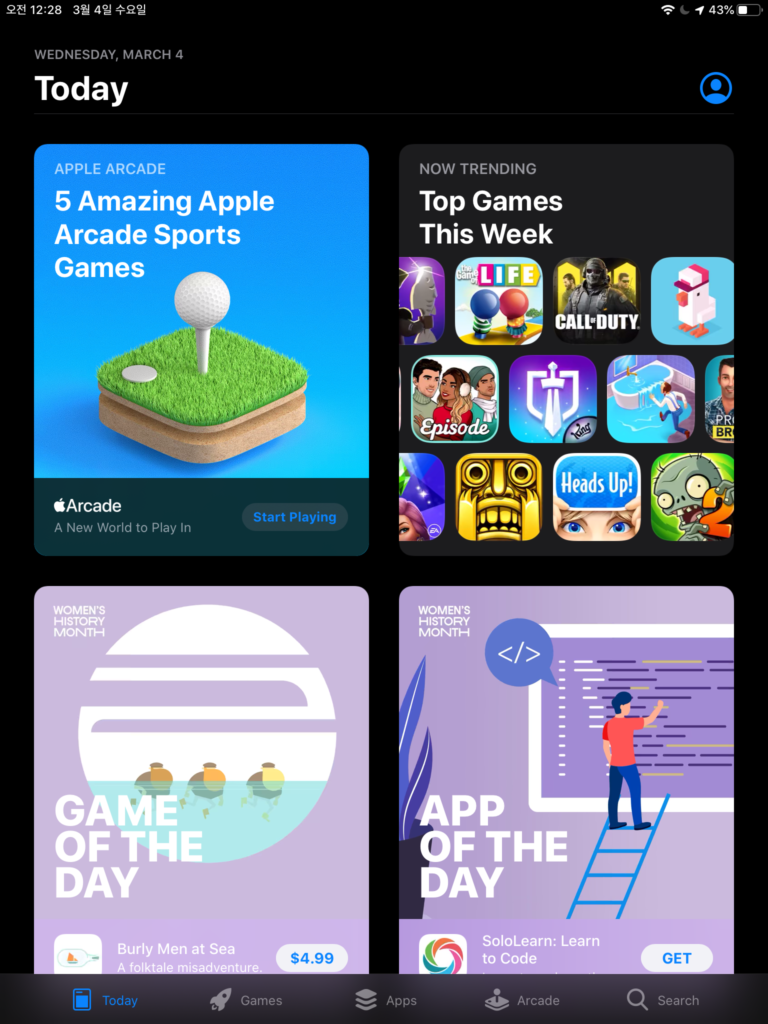
Personally, I don’t really open App Store and browse through to look at new apps and popular apps, unless I need an app with certain function but I don’t know which exact one to get or I have to update some apps. Looking into App Store, I found the structure and system of App Store reflect the attitude and behavior of the users like me and the users who have purchased a new device and have to install some starter applications. The overall experience on App Store involves pre-suasion, in which it offers some categories that users are likely to be interested before asking them to be interested in those categories.
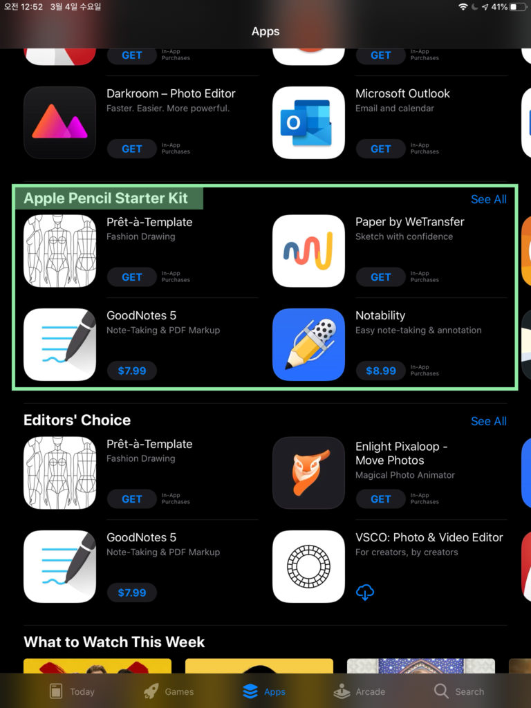
For example, under the on the Apps section, there is a recommendation section titled “Apple Pencil Starter Kit.” Most iPad users use Apple Pencil now. So, applications that a lot of users work with Apple Pencil are recommended in the section. This is the example of a persuasive action which is targeted to the specific users who are using this App Store with a particular device, iPad and Apple Pencil. Also, the rhetoric used is here is notable. The word choice of “Starter kit” connotes the importance of having those applications in the beginning stage of using Apple Pencil with iPad.
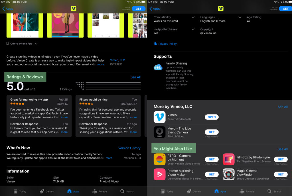
On the details pages of an application, we can see some more persuasive approaches. “Get” button to download the app is in the color blue, which triggers and persuades the users to press it. The color blue is an example of symbol in semiosis. Blue has been habitually representing a confirmation and agreeing button on digital systems. Ratings and Reviews section is persuading the users with interpersonal association. Users who would land on the details page might be interested in downloading the app already. So, App Store provides other people’s recommendation (or not) to the users to persuade them to download it (or not). On the bottom of the details page, there is a section “You Might Also Like.” This is an example of consistency. App Store is aligning its request (which is suggesting and persuading the user to look at other apps) with the user’s interest they have expressed by landing on to this details page. In addition, although not related to the user’s experience within the App Store, some application would use a method of “foot-in-the-door technique,” by persuading users to download the app for free on App Store and then persuade the users to make an in-app purchase.

Icons for each sections on the bottom (Today, Games, Apps, Arcade, and Search) are examples of semiotics. Game tab has an icon represented; it is an icon that is physically resembling the signified object, a game device. Today, Games, Apps, and Search tabs have symbols represented; they reflect habitual metaphor for those signified. For example, Search is with a magnifying glass icon which is often associated with searching function on digital experience.
With the persuasion tactics explained above, App Store did succeed to persuade me to look at some new applications but did not succeed to persuade me to download those applications. Looking at the “New to iPad?” and “Popular Apps” section, I was persuaded to look at the details page of some applications under those categories. However, it did not lead me to actually purchase or download those. Its structure of having intriguing categories was successful to persuade me to look through and click on the app details page. However, once I look at the details page and realized it was not I was looking for, I lost interest immediately.