For as long as I’ve had my own computer, I’ve installed some sort of ad-blocker extension in the browsers I have installed. When Content Blockers were introduced to iOS in 2015, it brought ad-blocking capabilities to my phone and iPad.
The reasons I, and many other people, block ads on the web is for improved privacy, security, and data usage. It also makes for a better browsing experience without obtrusive ads that occupy large portions of webpages, sometimes hijacking scrolling and playing unwanted videos, or worse, sounds.
Arguments against ad-blocking mainly center around the concern that blocking ads leads to decreased revenue by websites. I want to acknowledge that this holds some degree of validity, but when even the largest and most used ad providers occasionally serve ads containing malware, your browsing habits are tracked across websites via cookies, and the sheer amount of mass advertising we’re exposed to can affect the chemistry of our brains, any moral qualms I have about using an adblocker diminish.
With that in mind, I gathered examples over the past week of websites that detect adblockers and deploy various degrees of countermeasures. I then examined at these efforts based on the techniques used and gauged their effectiveness.
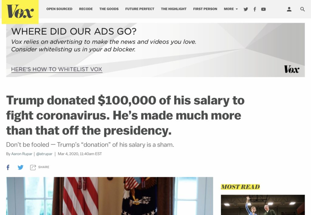
This banner on Vox takes the place of where an advertisement would go, and is pretty tame when it comes to these kinds of notices. The first line with the largest text size draws the reader, and by posing a question, encourages further reading of the banner by tapping into the human instinct of seeking answers. The second line of text explains their justification for the call to action that follows. At the end, a link to instructions on how to ‘whitelist’ the site in an adblocker‘s settings suggests a modification of behavior (adjusting preferences) instead of condemning the behavior altogether (telling readers to turn off adblocking), and avoids the use of the word ‘ads,’ which to many people has a negative connotation. The banner also uses a grayscale palette that doesn’t greatly detract from the rest of the website, and if you so choose, you can continue reading the article without obstruction. In a situation where the reader has all the decision-making agency, perhaps the most successful method to get people to adjust their behavior is to take a friendly, unobtrusive approach. Vox takes this into consideration successfully with their banner.
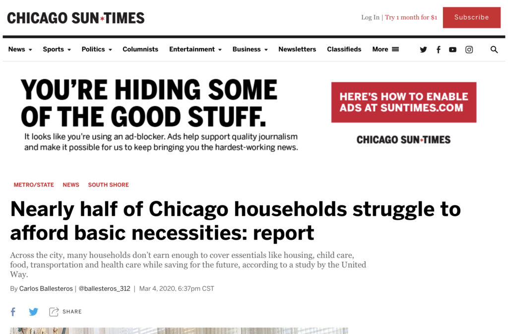
This banner from the Chicago Sun Times occupies almost half the page and is much more in-your-face. Unlike the Vox one, it has greater visual emphasis, with “YOU’RE HIDING SOME OF THE GOOD STUFF” in caps and larger, bolder text compared to the headline of the article and even the site’s header. By equating “the good stuff” to ads, the banner, for better or worse, encourages a decision of judgment. (I would wager that most people with adblockers enabled would not characterize ads as “good.”) The call to action is more ambiguous as well – instead of specifying one specific modification of the browser’s settings, it directly references re-enabling ads (still in caps), the opposite goal of using an adblocker in the first place. Note the large red button that immediately draws your eyes compared to everything else on the page – one must scroll down half a page for the article to come to focus.
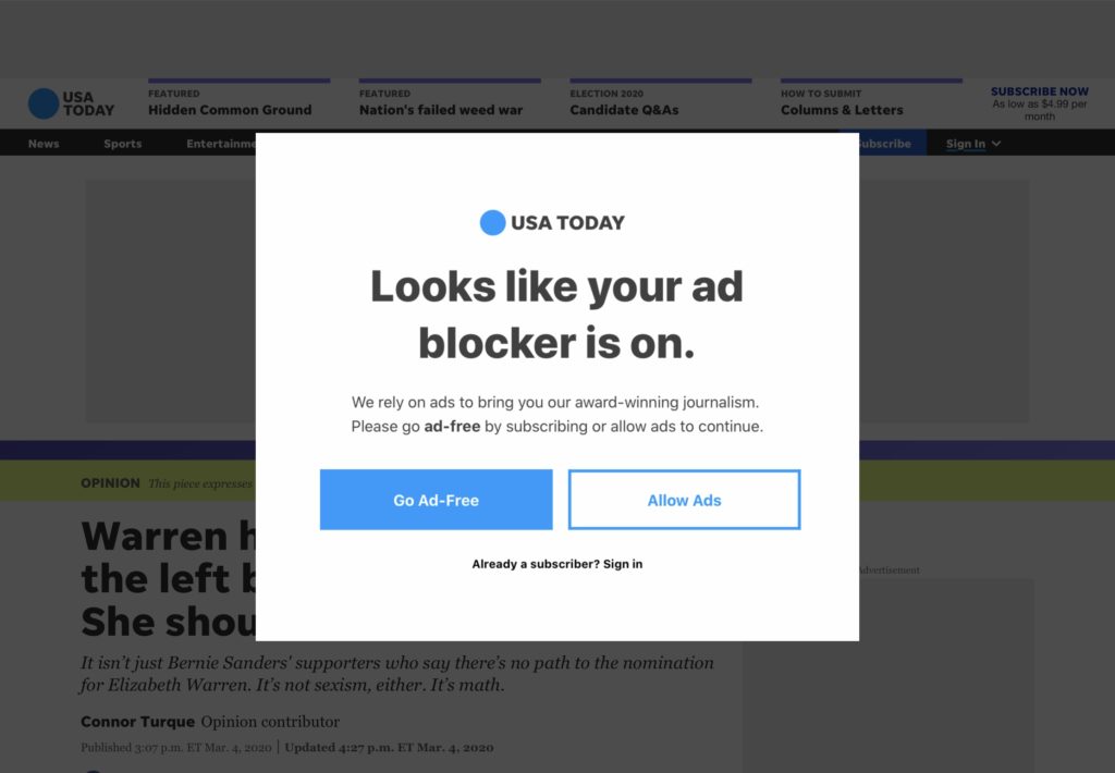
Unlike the previous examples, this USA Today popup completely covers the page: you don’t have the option of scrolling down or clicking away to close it. It’s also intriguing in that it presents two call to actions, the primary one being to subscribe to a paid service and the secondary to allow ads on the site (presumably linking to a page describing how to disable adblocking in a browser. For some people blocking access to the article that they wanted to read may successfully persuade them to act upon one of the suggestions. Personally, and I imagine this is also true of many who install and configure their own content blockers, I just find a way to circumvent the banner by loading Reader View or hiding the element – both simpler and more desirable options than taking on a new subscription or digging into the browser preferences panel and turning off the adblocker.
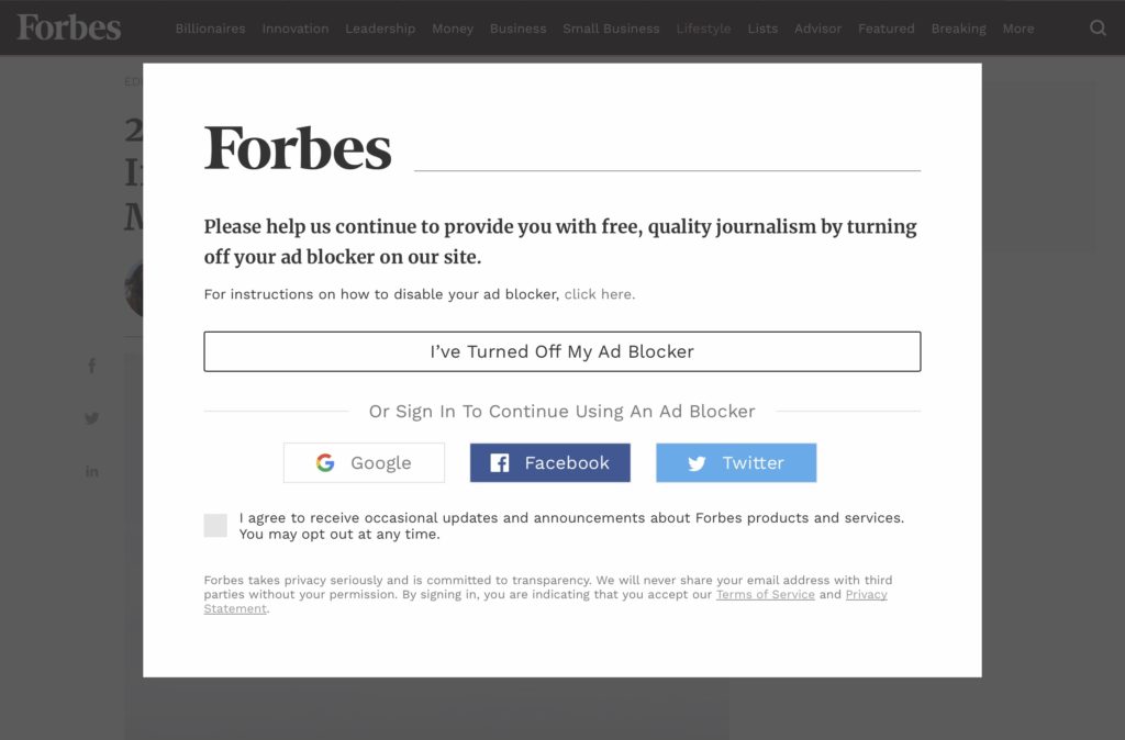
Perhaps the most notorious website for this kind of activity, Forbes’ pane takes anti-adblock to another level by adding several different options, including a checkbox that simultaneously functions as an agreement to terms of service and privacy policy as well as opting-in to marketing emails. As opposed to the other sites where the main button redirects you to a pages instructing you on how to disable/reconfigure your adblocker, the one on Forbes assumes that you’ve already taken this step. This is perhaps less effective persuasively because 1) it instructs you to disable, rather than adjust, your adblocker, and 2) it requires more mental and actionable steps (click the link above to disable your adblocker, then come back and perform a secondary action.
The second option Forbes presents is to sign into a social media account to continue, which from persuasive as well as privacy standpoint is unconvincing and perhaps even frightening, given the increasing level of public awareness about digital privacy (or lack thereof), especially involving social media accounts. I always see people on Reddit complaining about Forbes’ adversarial practices when it comes to adblocking – perhaps their approach contributes to this perception in its execution.
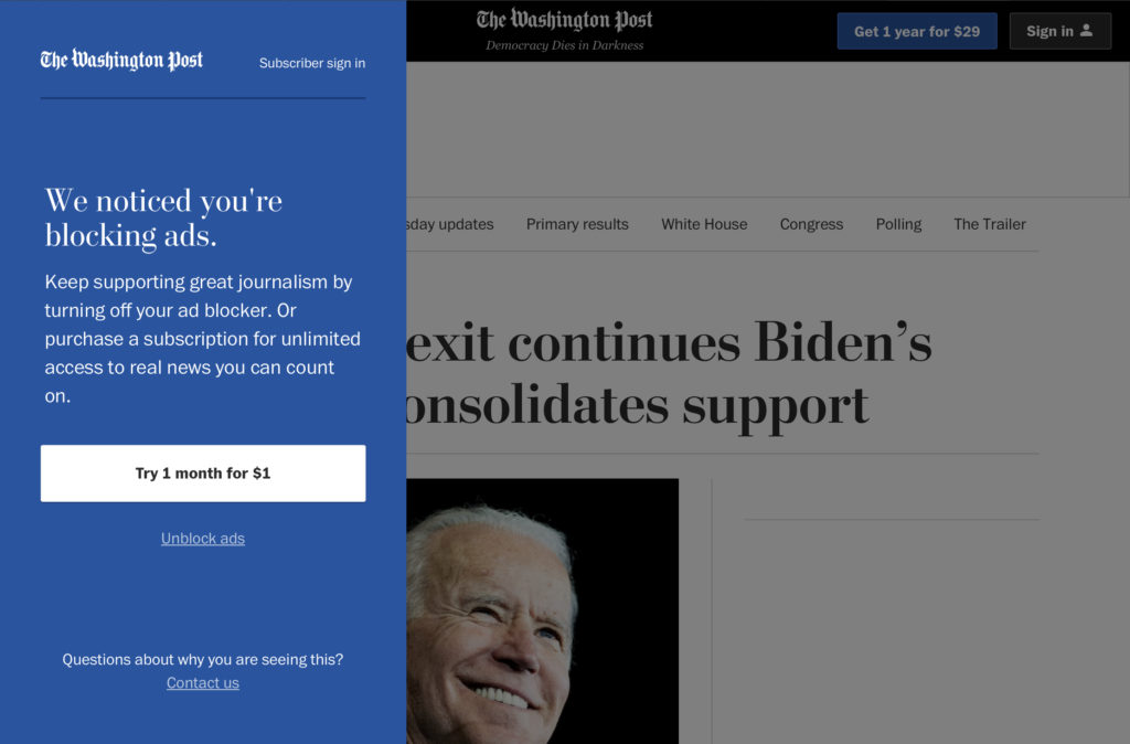
The last one of these pop-ups that I encountered was from the Washington Post, which employs a slide-in panel from the left. Nonetheless, it still restricts scrolling in the article. I found interesting that in the short blurb, they encourage you to turn off your ad blocker but also employ a bit of advertising that tries to sell you on the quality of their product.
Of all the options for signing up for a paid subscription, this one is probably the best because you are made aware of the low cost of trying only one month, sort of a foot-in-the-door approach. From the perspective of Washington Post, it really benefits for me to know about the upfront cost of a subscription before even clicking a button because I’ve already unconsciously decided whether the value proposition is a good one before even clicking another link, whereas on the other sites, I have no idea how much a paid subscription is and don’t have any incentive to click a link to find out.
In summary, although I won’t be adjusting or turning of adblocking on any of my browsers, I found that the most persuasive appeals to do so were those that were less intrusive in their design and footprint, soft-pedal the “disable your adblocker” aspect and word it instead as a modification of current settings, and offer a clearly-worded and simple alternative, such as exchanging $1 for unfettered access. In this situation, emotion is incredibly important to achieving the website’s goals: if they offer an alternative in a friendlily-word and designed manner instead of obstructing access in an adversarial approach, visitors are more likely to be receptive to the message.
Anecdotally, I’ve noticed fewer websites that deploy adblock countermeasures over the past two years. Whether this is a testament to the anti-anti-adblock capabilities being added to projects like uBlock Origin or more and more publishers moving to the subscription model remains to be seen. However, I believe more sustainable and ethical methods of revenue generation exist, whether it be hosting of advertising locally so that publishers are accountable for the ads they publish or moving to subscriptions. In an ideal world, adblockers would not be necessary because ads would be unobtrusive and respectful of privacy.
Ian Shei