Perhaps the ultimate goal of persuasion is to convince someone of buying something. Consumption is one of the many ways people demonstrate their inner values that are physically and metaphorically satiated through the use of goods and services. Through this project, I began to organize products and services that are advertised to me on Facebook into various value categories that demonstrate insight into how companies capitalize on my value system to generate profit. By underlining the connection between me and the product, I endeavored to reveal what stands out as a convincing topic to both me and other potential consumers.
The values that are listed on this chart are based on Alexander Osterwalder and Yves Pigneur’s book “Business Model Generation.” This brief list of value propositions illustrates how products and services deliver and contribute to the creation of values for customers. It essentially defines the problem space of the user and how the product proposes to solve that problem. This is crucial to me as a design student since addressing the appropriate user problem space is where most of the form factors of design are determined.
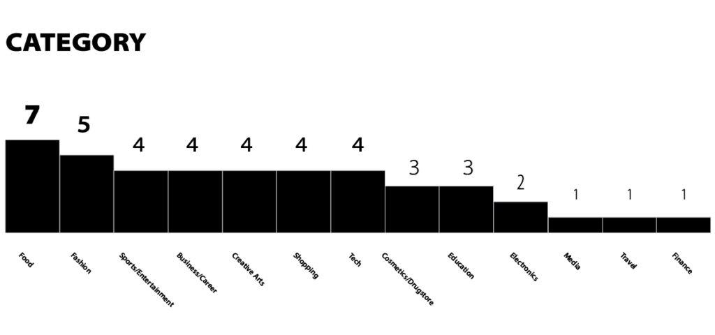
Organizing the advertisers reveals some important points to note. Food and Fashion make up the top two advertisers for this user, while there is only one advertiser from the Finance industry. While variation in the frequency of advertisers may characterize the general interests of the user, it does complete the entire story. The next graphs look into the specifics of the advertisers and tries to narrow down the user’s persona. Some possibilities of the result can be accounted by the frequency of using certain services. For instance, the frequency of using a food delivery service is much higher than shopping clothes. This poses a higher likelihood that Facebook over-counts the preference weight of the category “Food” compared to other categories.
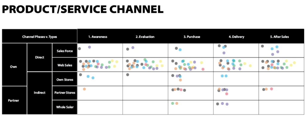
The composition of the primary channels the advertisers use for their business infrastructure illuminates how the user interacts with the world at large. It also illustrates the user’s ecosystem and how products and services interface with the user. Another benefit of this diagram is understanding the journey of user to business interaction and what kind of forms it takes on.
A lot of the crucial interactions between the user and the product happens on a screen. For me, it was surprising to see how much of food related companies advocate for convenience by integrating digital platforms to provide services such as delivery and meal-kits.
This chart visualizes the value propositions of each company.. Understanding how the advertiser is appealing to the user through its product and services illustrates the type of experience that the artifact communicates through its design.
Some of the key highlights on this chart is that usability and accessibility are core values most widely shared across various products and services. Simply making a process easier and more efficient is a value powerful enough to draw in people’s attention.