I focused on the promotional emails that I receive on a daily to weekly basis, most of them coming from organizations that I have made one or more purchase. All of them have shaped my behaviors in the past, with perhaps the exception of the Delta Airlines credit card promotion. Although the promotional advertisements may not have directly influenced my behavior with immediate effect, they leave a lasting image in my mind regarding the brand and the organization’s image, which may be a contributing factor when I make the next purchase.
All of them concerns itself with monetary matters, whether it is a call for donation or purchase. Asking people to take money out of their pockets is perhaps the most difficult task; the techniques employed in the following examples illustrate various ways in which these organizations take on the task.
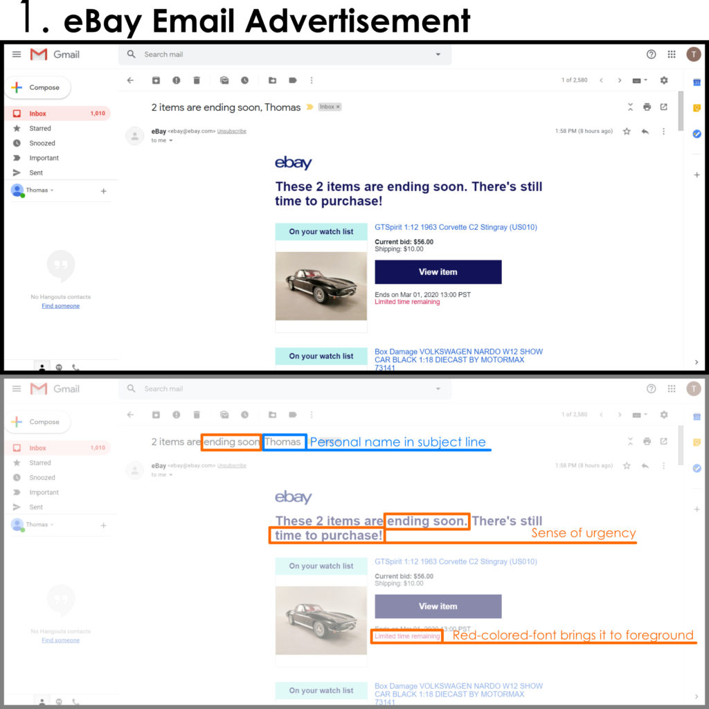
1. The first item is from eBay, notifying me of an auction that is about to end. The subject line includes my personal name. As Dale Carnegie said, “Remember that a person’s name is, to that person, the sweetest and most important sound in any language…” Even before clicking on the email to read its content, the name draws me in which gives off the illusion that the content is tailored just for me. The words in the content all have a sense of urgency, asking me to act immediately. There isn’t much writing within the content itself, which works to serve its intention: “View item” Now.
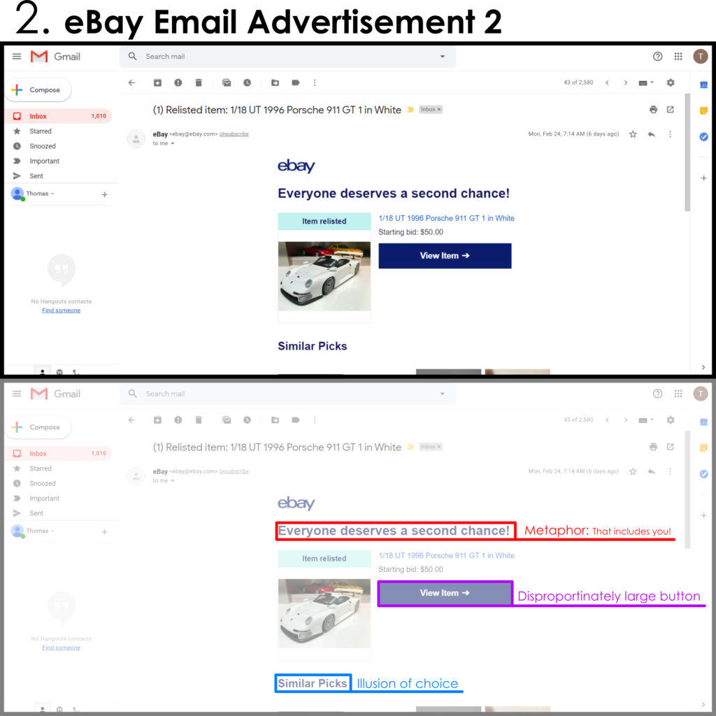
2. second item from eBay is very similar in that there is greater focus in trying to get the reader to click on the “View item” button. Its large size and contrasting colors bring it to the foreground, inviting users to click. The phrase “Everyone deserves a second chance!” is a very odd sounding phrase once you start picking it apart; the phrase alludes to the old saying of the same, but the saying is directed to those who have made a mistake, or failed. According to this email, it is a “mistake” to not purchase this item.
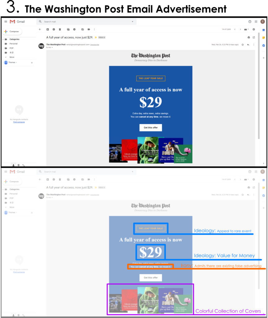
3. The third item comes from The Washington Post. What is immediately recognizable is its appeal to a rare event. This reference attempts to signify the rarity of such amazing deal as proposed by The Washington Post. The phrase “You can cancel at any time, we mean it.” is ironic in that the news outlets and media corporations often rely on subscriptions to run, and they do their best to prevent subscribers from cancelling their services. It is yet another illusion of choice.
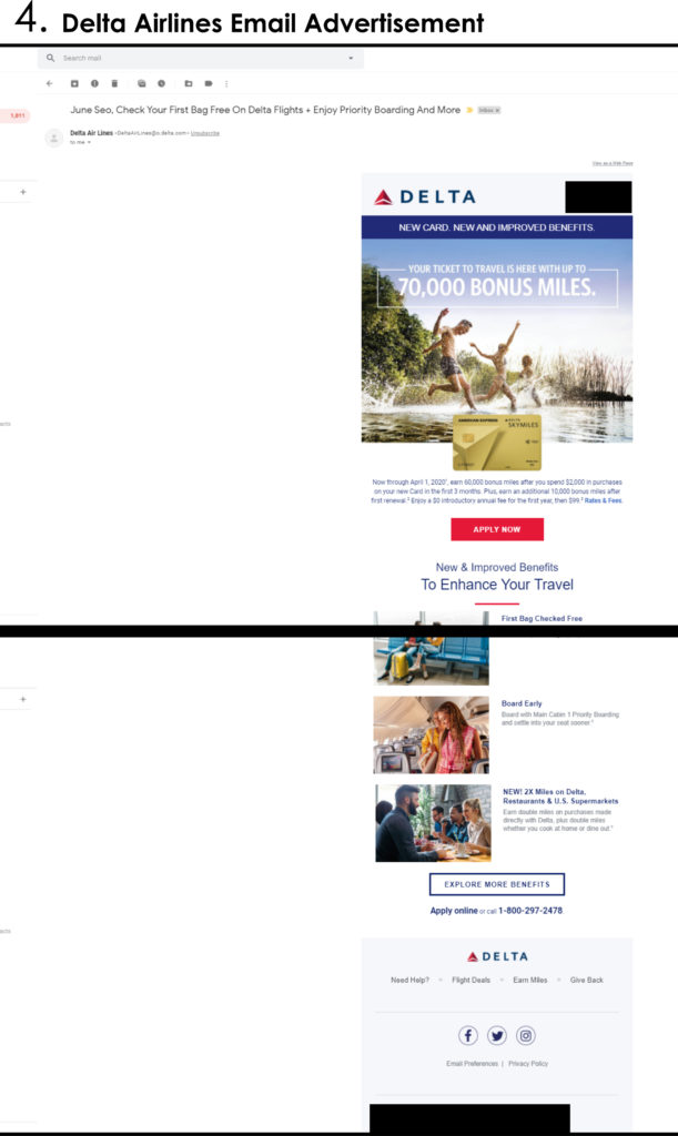
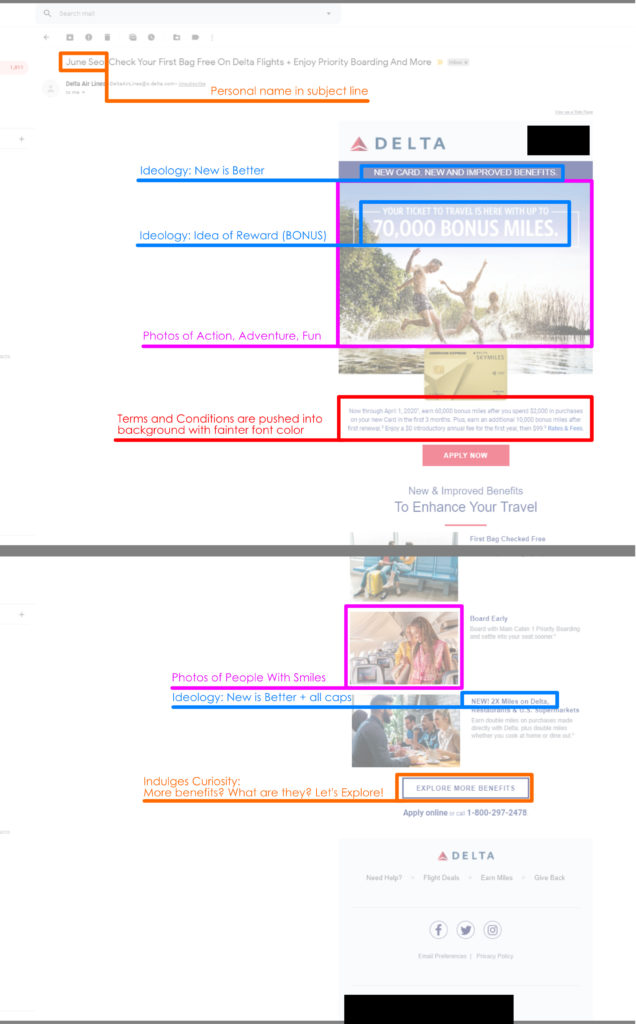
4. The Delta Airlines promotional email is long; and filled with photos of happy people. Their choice of photos ranges from action-packed adventures and casual dining. They seem to uphold values and activities that are desired by most people. This being a credit card advertisement, they do their best to hide the terms and conditions with the smallest of fonts and the faintest of colors. They also seem to appeal to the idea that new is better. The word “new” appears numerous times. Let go of the old and bad and embrace the new and good. Get the NEW Delta Airlines Card.
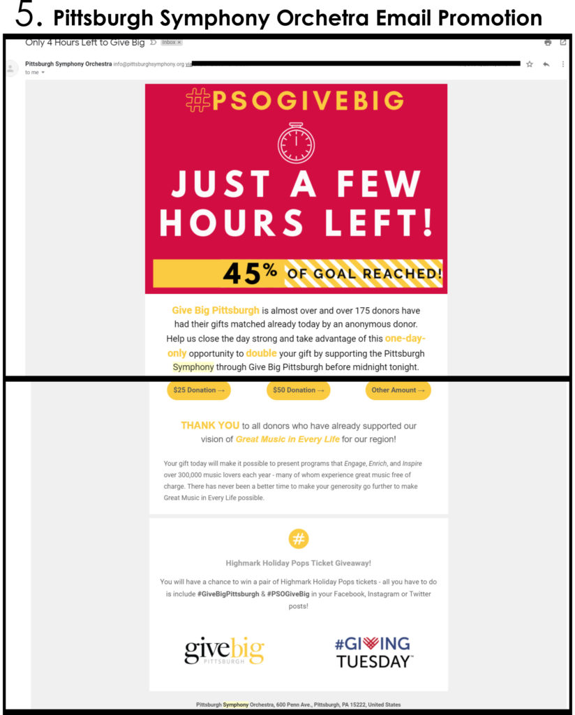
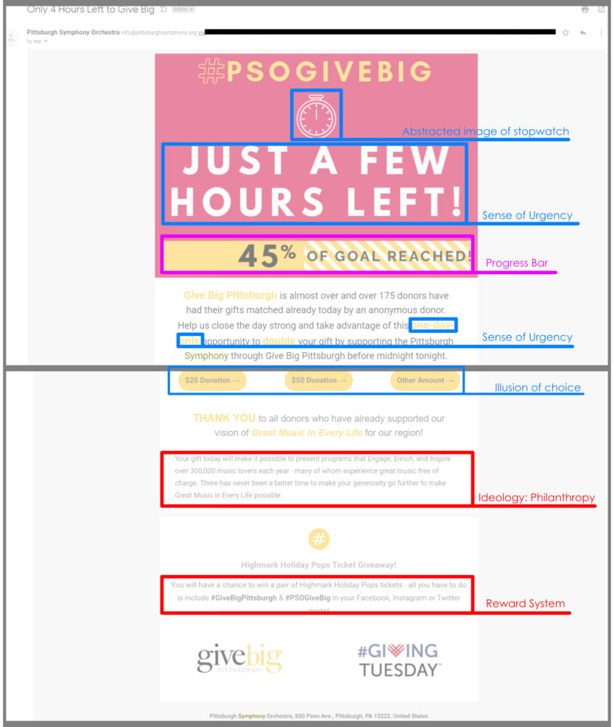
5. This fund-raising email from Pittsburgh Symphony Orchestra presents the reader with a high-contrast block of content with extreme sense of urgency. Animated stopwatch icon, and the progress bar below act as visual elements that encourage my behavior to act immediately. The progress bar is especially intriguing; it creates a sense of incompleteness, encouraging me to “finish the job”. The text also refers to giving back to the community, appealing to common moral value of philanthropy.
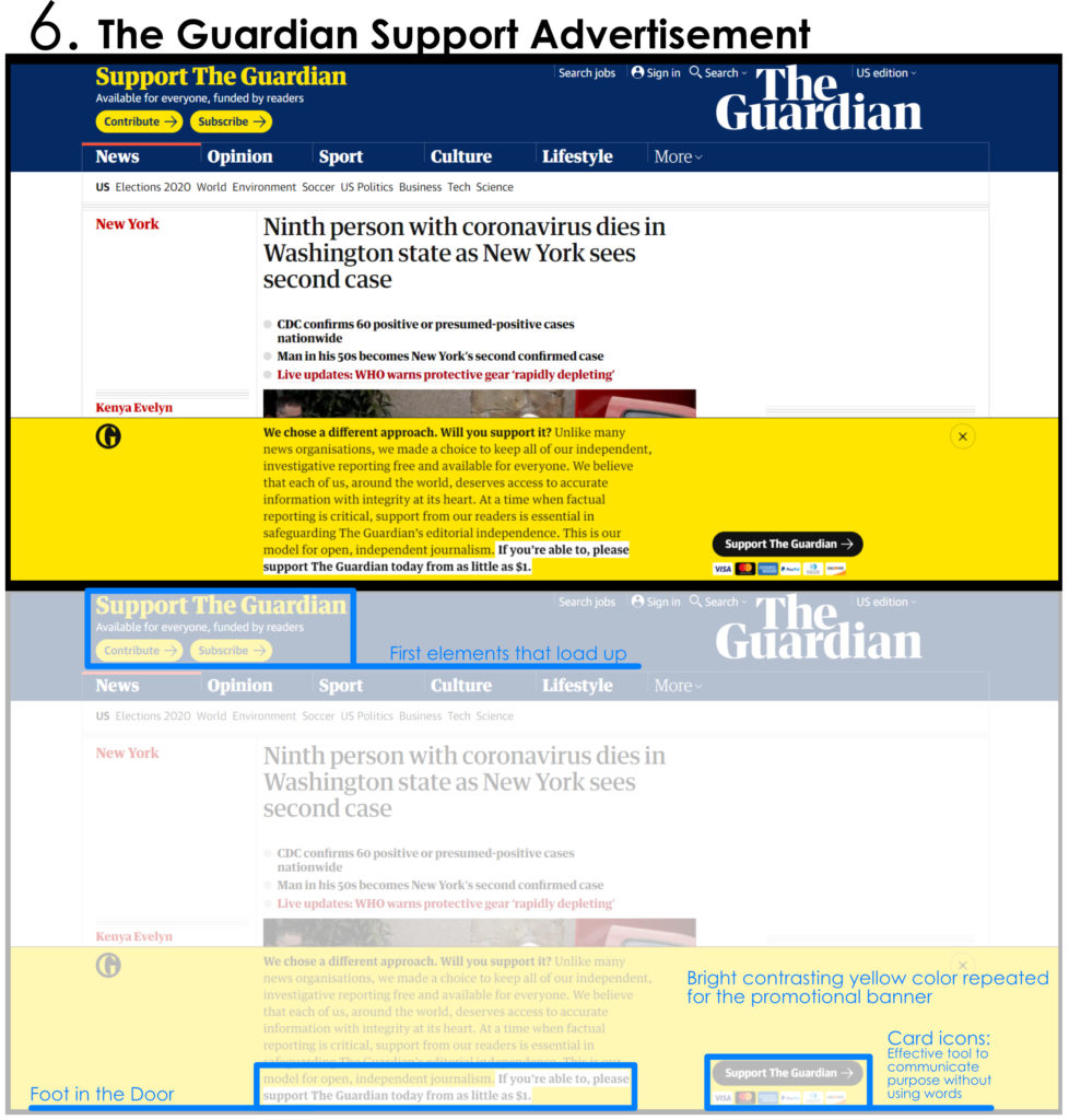
6. The last item is not an email, but the homepage of a website I visit numerous times daily. The Guardian had been undergoing a financial crisis, and it is clear through their careful placement of banners and icons throughout the website, encouraging readers to financially support the organization. By far the most interesting was their usage of colors. The yellow color does not appear anywhere else in the website, except in the promotional banners. The icons on the top left corner and the large banner on the bottom share both the same colors and the same message. The color yellow also resembles the color gold, an obvious visual metaphor of money.