Newspapers Need to Make Money, Too
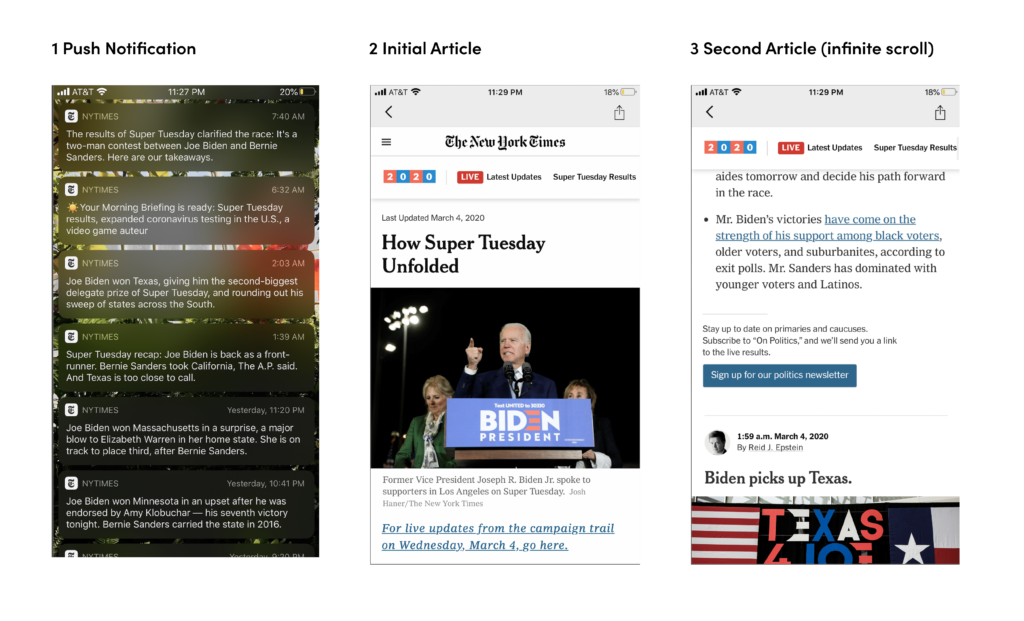
When we think of dark patterns in design, we often think of social media sites like Facebook, Instagram, and Twitter. The design practices they employ can range from infinite scroll to fear of loss (tricking the user to believe that a product is about to run out). What’s often less noticeable is how design is intentionally used to drive up user engagement on other types of platforms—even ones we might otherwise think are reputable. While these design decisions do not necessarily rise to the level of “dark design” and can often be argued away as “user friendly”, it is interesting to reflect on the effect of these design decisions.
The case study I want to delve into is one that is personal and relevant to me. As someone who spends probably too much time each day reading the news, I wonder to what extent the News applications themselves push me to read more content versus how much content I seek out. Over the course of a week, I tracked the news sites/applications I read and analyzed how many articles I read via a push notification, how many I directly sought out, and how many I read through through in-site/app suggestions (e.g. related articles and infinite scroll).
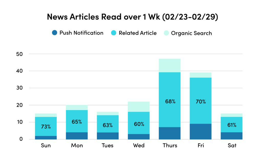
After conducting the personal study over the course of a week, I found that 60-75% of the articles I read were through a push notification or related articles. I was quite surprised to find out that most of the articles I read, and hence time I spent, reading the news was in many ways the result of design decisions made. During this entire process I sought to track the many ways that I was influenced to continue reading.
Design Influences
In Summary
Overall, this was a really interesting exploration into how seemingly mundane platforms are still companies that need to engage/retain users at the end of the day. In fact, a lot of the design practices that we might not associate with user engagement like infinite scroll can be found outside of social media. By simply being aware that these practices exist and are readily being used to keep me on any given platform is good, but does not go far enough. This is something that is not new, but is beginning to catch up in the design community especially. For one, there are a number of plugins and extensions in the works that aim to mitigate dark design and it will be interesting to see how they progress over the next few years. The main takeaway I get from this inquiry, however, is that we should always be thinking beyond the typical players and remember that engagement and attention matters regardless of the company or organization.